
Before we work on the page layouts we will add theme support to “break-out” of the container div and make certain content go full width. This creates a really nice effect. This is an option you need to setup and isn’t enabled by default on WordPress unless the theme says it supports it. Once enabled supporting blocks will give you these extra settings :
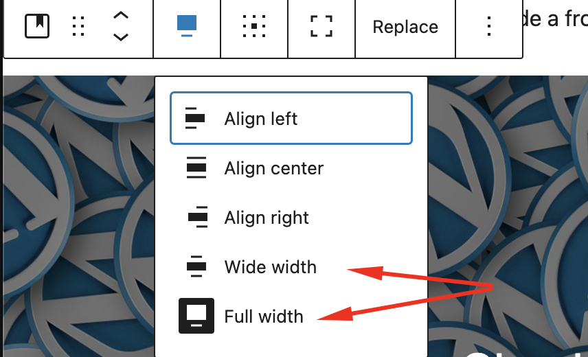
Enabling the feature is super easy, load up app/setup.php and then add this
add_theme_support('align-wide');You will find other add_theme_support declarations you can add it anywhere below one of the others.
If you try out the new setting though you will find it does nothing. Let’s use some clever CSS to do the work for us, we can target the new classes and use CSS to do the work of breaking out of the container div, this is what this CSS will achieve :
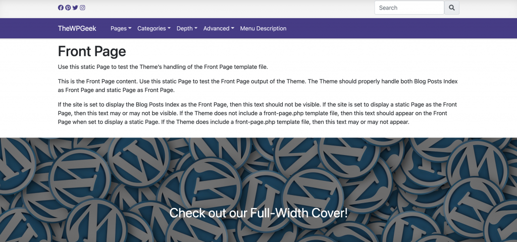
We also have some CSS here that handles the “wide” setting, but you can adjust this to be a little more subtle than I have it if you want it to break out just a little. I also added a media query that won’t enforce the margins on smaller screens so this will just go full width in that case.
// width support
.alignfull {
  width: 100vw;
  margin: 2rem calc(50% - 50vw);
}

.alignwide {
  width: 100vw;
  margin: 2rem calc(50% - 50vw);
}

@media (min-width: 768px) {
  .alignwide {
    width: calc(100% + 20vw);
    margin: 2rem -10vw;
  }
}
We now have the tools we need to create an awesome front page, which will be the topic of our next instalment!