In this section, we will get Bedrock set up on Cpanel hosting. In the advanced section of the Cpanel hosting panel, you should find the terminal. Run this command
Get to the public root directory, here you need to create new folder for a subdomain and go into that folder if you are following along. You can also use the domain root, but this will need you to make some changes to the document root later on to make this work. Once you have created your new folder, cd into it before running the install commands.
cd public_htmlnow run the install commands for bedrock
composer create-project roots/bedrockUpload your theme, DONT UPLOAD the node_modules folder! Before you do this build in your local environment using:
npm run build:productionUpload to :
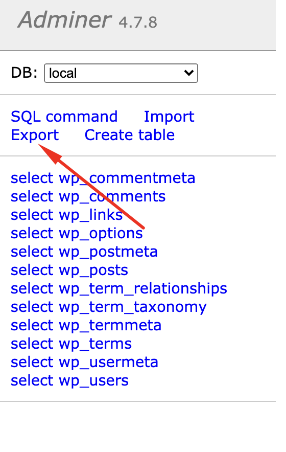
bedrock/web/app/themes/In local grab a copy of the database … Click the database tab, then “Adminer” you will likely have an error 404 – just wait for a second… Hopefully, that fixed itself, phew! Now click Export :
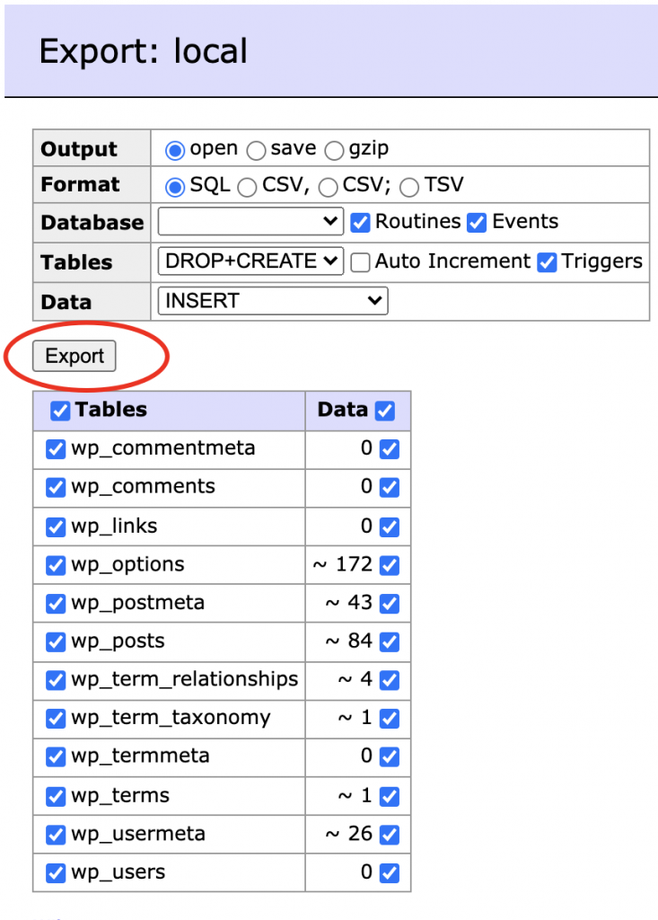
the defaults will be fine:
Okay, from Cpanel make a new database (in the MySql Databases option), Now create a new user, and add the user to the DB. Load up PhpMyAdmin and choose the new Database you created, click “Sql” and paste everything output by the export function in Local Adminer.
Now go to cpanel > File Manager > Navigate to the “Bedrock” Folder. In the top right click “Settings” Select “Show Hidden Files” (Mine shoed it was selected, but I needed to click and save the checkbox before I could “actually” see hidden files! Rename the file .env.example to .env and edit the file, You need to change lines 1,2,3,13,14. These lines will be Database, username, password and URL, so have these ready. Once done generate new salts by visiting the link in the file, and pasting the result back.
Now, we need to update the document root. I’m doing this with a subdomain here (easy) but you can also do it with the document root if you have access to whm, or contact your host. Create a new subdomain using the folder you used to put the files in.

Lastly, go back to your .env file and update lines 13,14
WP_ENV='production'
WP_HOME='https://examplesite.yourdomain.com'
Now visit the admin panel (https://yoursubdomain.yourdomain.com/wp/wp-admin)
Change your password!
Now, BEFORE ANYTHING ELSE change your login password. Until now you have been developing locally and are probably using an insecure password, you have just copied the DB to a live site, your password now needs to be secure.
go to themes, and activate your new theme!
Now, back to the terminal in Cpanel, navigate to your new theme directory
cd public_html/examplesite/bedrock/web/app/themes/yourthemerun install
composer installin bedrock/config/environments/ create the file “production.php”
I always allow plugins to be updated and added from the wp-admin, so add this to the file if needed:
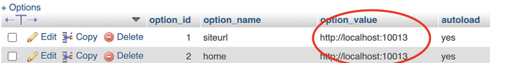
Config::define('DISALLOW_FILE_MODS', false);Now back to PhpMyAdmin, we need to update the site url from the localhost one to the live url. Update the first 2 items in wp_options
Last thing, go to Settings > Permalinks > Save
So, did it work? If you want the site to be on the root of the domain and not a subdomain (which to be honest is usually the case) you will need full root access to your server. It really isnt too hard to do, but I realize many may not have the required access so decided to write the tutorial based on a subdomain. You can follow all the steps listed, but follow this guide to update your document root from WHM. You may also want to do a refresher on saving and navigating using vim.
Remember this stuff never gets easier, you just get better – and if you have got through all of this you are doing awesome!