Add a Template Partial in Sage

As part of the header design I wanted to add another area above the navbar to contain social icons and the search bar. As we scroll down this are will disappear and the nav element will become sticky to the top of the page. This is what we will achieve in todays post, or if you are not following along with the series as we create a new theme from scratch using Sage, you can just read this post to learn about creating template partials.

We could just put all our code for this in the header.blade.php file, but it’s better to organize and split up the code into smaller chunks so we will be creating a header-top.blade.php file to contain the new code. This is called a template partial. We will be calling this in the header.blade.php file. Lets first create the new php file :

resources/views/partials/header-top.blade.php

For now just write some placeholder text in the file and save.

Load up resources/views/partials/header.blade.php and at the top of the file add this :

@include('partials.header-top')

You should now see the placeholder text appear above your menu bar. Lets also add the class “sticky-top” to the nav tag class list, so it should now look like :

<nav class="navbar navbar-expand-md navbar-light bg-light sticky-top" 

As we scroll down the Navbar will stick to the top of the page.

Let’s style our new templated section. Our _navbar.scss file that we created in a previous step should be located in resources/styles, replace the contents with this :

.brand {
  margin-right: 2rem;
  font-size: 1.2em;
  text-decoration: none;
  color: black;
}

.top-header {
  padding: 10px;
  background-color: whitesmoke;
  border-top: #202331 4px solid;
  box-shadow: rgba(0, 0, 0, 0.1) 0 30px 50px -12px inset;
  box-shadow: rgba(0, 0, 0, 0.3) 0 15px 32px -18px inset;
}

.nav-custom {
  background-color: darkslateblue;
}

.nav-custom a {
  color: white;
}

.dropdown-menu {
  background-color: #202331;
}

.social {
  color: darkslateblue;
  transition: all ease-out 0.5s;
  -moz-transition: all ease-out 0.5s;
  -webkit-transition: all ease-out 0.5s;
  -o-transition: all ease-out 0.5s;
}

.social:hover {
  text-shadow: 0 5px 5px rgba(0, 0, 0, 0.3);
  transition: all ease 0.5s;
  -moz-transition: all ease-in 0.5s;
  -webkit-transition: all ease-in 0.5s;
  -o-transition: all ease-in 0.5s;
}

.facebook:hover {
  color: #4267b2;
}

.twitter:hover {
  color: #1da1f2;
}

.youtube:hover {
  color: #c4302b;
}

.pinterest:hover {
  color: #c8232c;
}

.instagram:hover {
  color: #fada5e;
}

Remove the search form we added in header.blade.php as we will be putting it in our new top area. In our header-top.blade.php file replace the contents with the following code :


<div class="top-header">
<div class="wrap container">
<div class="d-flex justify-content-between">
<div class="align-self-center">

<div class="wrapper">
<a href="#"><i class="fab fa-facebook social  facebook "></i></a>
<a href="#"><i class="fab fa-pinterest social  pinterest "></i></a>
<a href="#"><i class="fab fa-twitter social  twitter "></i></a>
<a href="#"><i class="fab fa-instagram social  instagram "></i></a>

</div>

</div>
 <div>
    <form class="d-flex input-group w-auto">
      <input
        type="search"
        class="form-control rounded"
        placeholder="Search"
        aria-label="Search"
        aria-describedby="search-menu"
      />
      <span class="input-group-text text-white" >
        <i class="fas fa-search"></i>
      </span>
    </form></div>

</div>
</div>
</div>

This is not a styling tutorial so I won’t be going into detail on this, I generated the social media icons from my generator page and a box-shadow to the top menu using my box-shadow generator. It uses bootstraps d-flex class, to create a flexbox, and the “align-self-center” class to space vertically. We also use <div class=”wrap container”> to space the content correctly. Our header should now be styled like this :

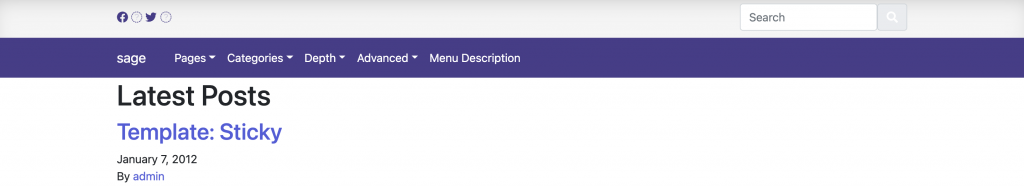
We have a few small things left to fix, which we will tackle in the next section where we will finish off our header area. In a previous section we imported the Facebook and Twitter icons, we are missing fa-instagram and fa-pinterest. I did this for 2 reasons, the first to illustrate that we haven’t loaded the entire FontAwesome Library – just the icons we needed, and lastly to give you an opportunity to fix this yourself to help retain the information better. So, see if you can fix the missing icons, and I will see you in the next section!

Add Font Awesome to Sage Theme

We are going to use a few icons from FontAwesome. With a little bit of extra work we can import only the icons we need, instead of the entire library (10x faster according to FortAwesome), We are aiming to make a theme with 95%-100% rating for page speed, so this extra work is essential to this aim.

I plan on using some social media icons and a search bar in the nav menu we have just created, so before we move onto that let’s spend some time learning how to correctly import these icons. From our terminal window, run this command :

yarn add @fortawesome/fontawesome-svg-core

We will need to now add the individual font libraries that we will be picking font from, for me they will be the most common 2 :

yarn add @fortawesome/free-solid-svg-icons
yarn add @fortawesome/free-brands-svg-icons

Next, we need to choose the individual icons that we will be loading, to do this, we will be exploring the resources/assets/scripts/main.js file, add the following :

import { library, dom } from '@fortawesome/fontawesome-svg-core';
import { faFacebook, faTwitter } from "@fortawesome/free-brands-svg-icons";
import { faSearch } from '@fortawesome/free-solid-svg-icons';
library.add(faFacebook, faTwitter, faSearch);

dom.watch();

To import new icons to use, we will need to come back to this file and add it to the icon name object and library.add

If you are following along with this series, lets make sure everything is working and replace the header.blade.php file with the following :

<nav class="navbar navbar-expand-md navbar-light bg-light" role="navigation">
  <div class="container">

    <!-- Brand and toggle get grouped for better mobile display -->
    <button class="navbar-toggler" type="button" data-toggle="collapse" data-target="#bs-example-navbar-collapse-1" aria-controls="bs-example-navbar-collapse-1" aria-expanded="false" aria-label="<?php esc_attr_e('Toggle navigation', 'your-theme-slug'); ?>">
        <span class="navbar-toggler-icon"></span>
    </button>
   <!-- <a class="brand" href="{{ home_url('/') }}">{{ get_bloginfo('name', 'display') }}</a> -->

   @if (has_nav_menu('primary_navigation'))
  {!! wp_nav_menu(['theme_location' => 'primary_navigation',
    'depth'           => 2, // 1 = no dropdowns, 2 = with dropdowns.
    'container'       => 'div',
    'container_class' => 'collapse navbar-collapse',
    'container_id'    => 'bs-example-navbar-collapse-1',
    'menu_class'      => 'navbar-nav mr-auto',
    'fallback_cb'     => 'WP_Bootstrap_Navwalker::fallback',
    'walker'          => new WP_Bootstrap_Navwalker()]) !!}
@endif


    <form class="d-flex input-group w-auto">
      <input
        type="search"
        class="form-control rounded"
        placeholder="Search"
        aria-label="Search"
        aria-describedby="search-menu"
      />
      <span class="input-group-text text-white" >
        <i class="fas fa-search"></i>
      </span>
    </form>

    </div>

</nav>

We should now see the search icon image next to a search box. We will be modifying this search box shortly, and changing the header significantly in the next tutorial.

Soil and Demo Content

We should do a tiny bit more setup just to make things smoother as we progress. First I want you to install wp-cli – this is the “WordPress – Comand Line Interface”. I won’t be using it much, but you will find it’s often used in documentation so I found it useful to have.

curl -O https://raw.githubusercontent.com/wp-cli/builds/gh-pages/phar/wp-cli.phar

Now, lets move it from whatever directory you just put it in, and make it accessible everywhere

chmod +x wp-cli.phar
sudo mv wp-cli.phar /usr/local/bin/wp

Install Soil

Read about the advantages and cleaner markup using soil on the official sage soil page here You will notice it costs money, however, it is released under the MIT license which means we can install it and use it free of charge. They do great work and the support given from paying for this plugin is small compared to the benefits of bedrock/sage/soil. So use the plugin now to try it out but once the site is launched circle back around and pay for the license.

composer require roots/soil

Back in your theme folder (bedrock/web/app/themes/name) reload everything

npm run start

Go to your admin panel and activate the Soil plugin.

app/setup.php

Take a look in the app/setup.php file, this one is important and you will likely use it a lot, you add theme support, menus and image sizes here. Lets just add a new image size for now, around line 50 you will find this :

    /*
     * Enable post thumbnails
     * @link https://developer.wordpress.org/themes/functionality/featured-images-post-thumbnails/
     */
    add_theme_support('post-thumbnails');

underneath, lets add our new image size

 add_image_size('post-featured', 1280, 628, true);

We will come back to this file as we develop our theme. Our next tutorial will show you how to tackle the menu, but before we do this let’s install the Theme Unit Test dummy content. On the linked page, you will find an XML file to download. This will add a bunch of test content, including items we can add to our menu. Once you have it downloaded, go to your admin panel and Tools > Import and install the importer :

Lastly, once the install has finished, click “Run Importer” and then choose the downloaded XML file and import some dummy data using the setting below

All set for tackling the menu!

Install Sage Starter Theme

Okay, so hopefully now we have Bedrock working. The next part in our development workflow is to get Sage installed. Navigate to your themes folder here is the location of mine :

File structure of sage theme

We can either load the terminal type in “cd ” and then drag the theme folder into the terminal window OR, a slightly different way I will show you this time would be to right-click the themes folder at the bottom of the Finder window and click “copy pathname” you can then type cd and paste the pathname into the terminal, however, my Local installation made a folder called “Local sites” (note the space) so you would need to escape the space in the pathname (“Local\ sites”). Dragging the folder to the terminal avoids this issue. Windows users you are on your own!

copy pathname example

Now, lets make Composer do some magic and paste this into terminal

composer create-project roots/sage your-theme-name
install process of sage theme screenshot

Answer all the questions it asks you, clicking enter will save the default. If you are following along with the series, make sure to choose Bootstrap (1) when asked. We will use Bootstrap to make a responsive menu in an upcoming section

So we are almost done, if we navigate into out new theme folder we will find a package.json file, this is a file that lists the project dependencies that we now need to install. So let’s go to this folder in the terminal – either copy the path or drag the folder right into the terminal to change the directory.

The official docs tell you to type in “yarn” I have node.js installed so I use this. If you have neither of these, then I would recommend installing node.js now before continuing and follow along with me.

npm install

once this has completed, type in :

npm run start

After a few seconds, your browser will launch, and you will be able to login to your admin panel and change the theme to the new sage theme we have set up.

Page not load?
Okay, so if your browser keeps spinning, you are one of the lucky ones that get to complete one last step! Load up local and click “open site”, then copy the URL of the page that loads up. Now, from vscode go to : web/app/themes/themename/resources/config.json then on line 12, where it has the “devUrl” paste in the correct url for your site. Now try running npm run start once more.

Extra:

Now if you don’t have Yarn, installed lets get that on out systems globally. First, because we have started the development server in our terminal we need to press control+c to end the session – we can use Node to install it so just type :

sudo npm install --global yarn

Type in your password.

The official docs and most tutorials for Sage use Yarn, so now you can too 🙂

The development environment is now set up our code will be automatically optimized, and we can begin to develop our theme. Check out our next tutorial as we begin to build our theme.