In this section, we will get Bedrock set up on Cpanel hosting. In the advanced section of the Cpanel hosting panel, you should find the terminal. Run this command
Get to the public root directory, here you need to create new folder for a subdomain and go into that folder if you are following along. You can also use the domain root, but this will need you to make some changes to the document root later on to make this work. Once you have created your new folder, cd into it before running the install commands.
cd public_html
now run the install commands for bedrock
composer create-project roots/bedrock
Upload your theme, DONT UPLOAD the node_modules folder! Before you do this build in your local environment using:
npm run build:production
Upload to :
bedrock/web/app/themes/
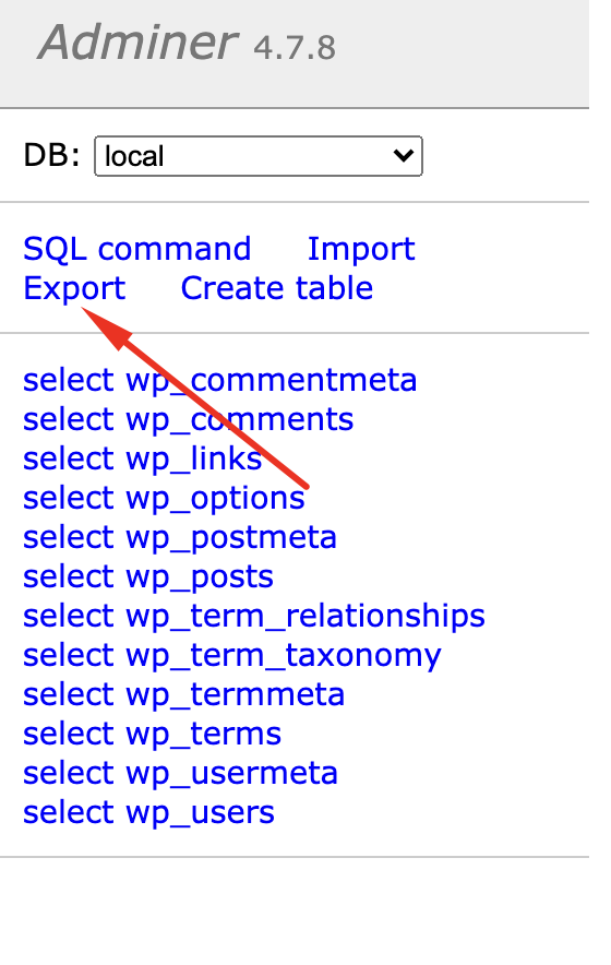
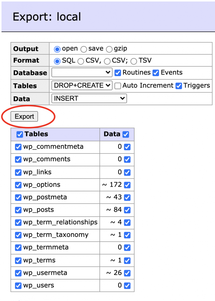
In local grab a copy of the database … Click the database tab, then “Adminer” you will likely have an error 404 – just wait for a second… Hopefully, that fixed itself, phew! Now click Export :
the defaults will be fine:
Okay, from Cpanel make a new database (in the MySql Databases option), Now create a new user, and add the user to the DB. Load up PhpMyAdmin and choose the new Database you created, click “Sql” and paste everything output by the export function in Local Adminer.
Now go to cpanel > File Manager > Navigate to the “Bedrock” Folder. In the top right click “Settings” Select “Show Hidden Files” (Mine shoed it was selected, but I needed to click and save the checkbox before I could “actually” see hidden files! Rename the file .env.example to .env and edit the file, You need to change lines 1,2,3,13,14. These lines will be Database, username, password and URL, so have these ready. Once done generate new salts by visiting the link in the file, and pasting the result back.
Now, we need to update the document root. I’m doing this with a subdomain here (easy) but you can also do it with the document root if you have access to whm, or contact your host. Create a new subdomain using the folder you used to put the files in.
Set up new Document root.
Lastly, go back to your .env file and update lines 13,14
Now visit the admin panel (https://yoursubdomain.yourdomain.com/wp/wp-admin)
Change your password!
Now, BEFORE ANYTHING ELSE change your login password. Until now you have been developing locally and are probably using an insecure password, you have just copied the DB to a live site, your password now needs to be secure.
go to themes, and activate your new theme!
Now, back to the terminal in Cpanel, navigate to your new theme directory
cd public_html/examplesite/bedrock/web/app/themes/yourtheme
run install
composer install
in bedrock/config/environments/ create the file “production.php”
I always allow plugins to be updated and added from the wp-admin, so add this to the file if needed:
Config::define('DISALLOW_FILE_MODS', false);
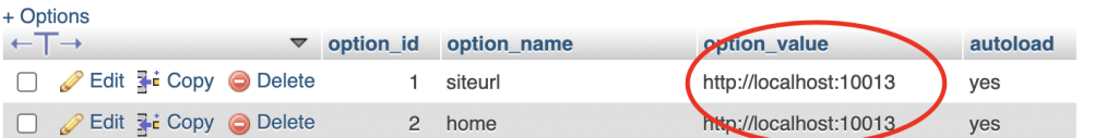
Now back to PhpMyAdmin, we need to update the site url from the localhost one to the live url. Update the first 2 items in wp_options
Last thing, go to Settings > Permalinks > Save
So, did it work? If you want the site to be on the root of the domain and not a subdomain (which to be honest is usually the case) you will need full root access to your server. It really isnt too hard to do, but I realize many may not have the required access so decided to write the tutorial based on a subdomain. You can follow all the steps listed, but follow this guide to update your document root from WHM. You may also want to do a refresher on saving and navigating using vim.
Remember this stuff never gets easier, you just get better – and if you have got through all of this you are doing awesome!
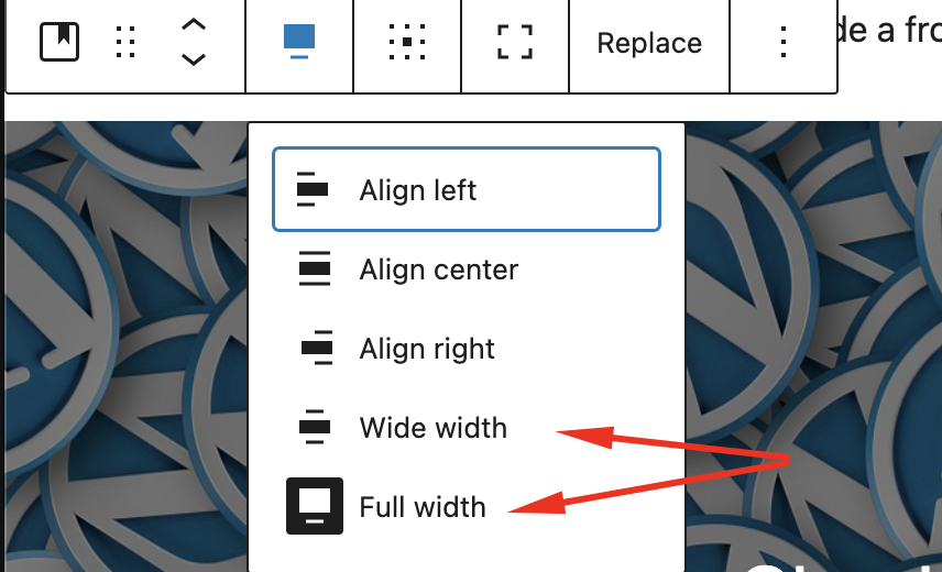
Before we work on the page layouts we will add theme support to “break-out” of the container div and make certain content go full width. This creates a really nice effect. This is an option you need to setup and isn’t enabled by default on WordPress unless the theme says it supports it. Once enabled supporting blocks will give you these extra settings :
Enabling the feature is super easy, load up app/setup.php and then add this
add_theme_support('align-wide');
You will find other add_theme_support declarations you can add it anywhere below one of the others.
If you try out the new setting though you will find it does nothing. Let’s use some clever CSS to do the work for us, we can target the new classes and use CSS to do the work of breaking out of the container div, this is what this CSS will achieve :
We also have some CSS here that handles the “wide” setting, but you can adjust this to be a little more subtle than I have it if you want it to break out just a little. I also added a media query that won’t enforce the margins on smaller screens so this will just go full width in that case.
Sage comes with a footer sidebar ready to go, so we will change this to a 3 column grid where it will space out 1-3 widgets across the bottom of the footer. Sage comes with an empty stylesheet for the footer scss, but first let’s create the class we need to style it as we need. Load up the footer template, located in resources/views/partials/footer.blade.php
In this file we have a container that sets the margins on the left and right and puts the content in the middle, this is opened after the footer so we can target the footer background color directly and it will be full width. We do however need to create a new DIV which will become our grid container. Here is my footer file with the new div and class added :
This creates a grid that spreads out 3 columns equally across the available space. Note that you can easily change the number of supported columns and widgets if you wanted 4 widgets across the footer just change to this repeat(4, 1fr);
Our previous widget styling CSS needs a little update for the footer as it will be over a different color background. Here is the CSS to update the background color and change the font and line colors.
One of the basics I would often find myself doing is creating an advanced “latest posts” plugin, mainly so I could style the latest posts widgets a little nicer. This tutorial will show you how to create this plugin, and will give you some ideas to styling the sidebar.
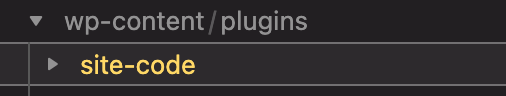
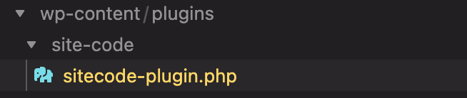
First, navigate to your plugins folder and create a new folder, I’m calling it a generic “site-code”. If you are following this tutorial exactly and are using Bedrock skip down to the yellow note below.
Now, we create a php file, mine is called sitecode-plugin.php
Note: If you are using Bedrock
wp-content/plugins is not the correct path for your new plugin. If you are following my tutorial and using Bedrock then you will be adding the plugin here: app/bedrock/web/app/plugins –
In this file, we need some important code so WordPress knows this is a plugin, copy this and paste it into this new file :
<?php
/*
Plugin Name: Theme Code
Description:  Bundle of Theme Widgets and various site code.
*/
This will now show up in the plugins folder :
We now need it to do something! for this tutorial, we will create a new widget, but this plugin is going to be used to put various site-specific code into as we build the theme. Even though the PHP code is going to be added to the plugin, I will be adding the CSS code into _global.scss, I have no need to create plugin-specific style sheets as these are all made on a per-site basis. To make the plugin more reusable we would need to enqueue its own style sheet – but if we build these widgets to be site-specific we are able to avoid a lot of wasted network requests for stylesheets and often lots of CSS code that doesn’t get used. For example, the code we write here for the cards can also be used on our category pages.
The purpose of this tutorial is the workflow of Bedrock/Sage, not so much how to make plugins or widgets, but we still want to end up with a nice looking basic theme, so without explanation here is the plugin code :
<?php
/*
Plugin Name: Theme Code
Description:  Bundle of Theme Widgets and various site code.
*/

// Creating the widget
class newpost_widget extends WP_Widget
{
    public function __construct()
    {
        parent::__construct(
'newpost_widget',

__('Advanced New Posts Widget', 'newpost_widget_domain'),

['description' => __('New Posts', 'newpost_widget_domain')]
);
    }

    public function widget($args, $instance)
    {
        $title = apply_filters('widget_title', $instance['title']);

        echo $args['before_widget'];
        if (!empty($title)) {
            echo $args['before_title'].$title.$args['after_title'];
        } ?>

	<div class="cards">
    <?php
    $excludeid = ''; // make an array if you need more featured spots.
        $recent_posts = wp_get_recent_posts([
        'numberposts' => 1, // Number of recent posts thumbnails to display
        'post_status' => 'publish', // Show only the published posts
        'meta_key' => '_thumbnail_id', // only with images to keep consistant display
    ]);
        foreach ($recent_posts as $post_item) { ?>

 <?php $image = wp_get_attachment_image_src(get_post_thumbnail_id(($post_item['ID'])), 'single-post-thumbnail'); ?>
 <?php $excludeid = $post_item['ID']; ?>
	<a class="card" href="<?php echo get_permalink($post_item['ID']); ?>">
			<span class="card-header" style="background-image: url(<?php echo $image[0]; ?>);">
				<span class="card-title">
					<h3>  <?php echo esc_html($post_item['post_title']); ?></h3>
				</span>
			</span>
			<span class="card-summary">
		<?php echo wp_strip_all_tags(get_the_excerpt($post_item['ID']), true); ?>
			</span>
			<span class="card-meta">
		<?php echo esc_html($post_item['post_date']); ?>
			</span>
		</a>
    <?php wp_reset_query(); } ?>

<ul> <div class="card">
<?php
     $recent_posts = wp_get_recent_posts([
        'numberposts' => 5, // Number of recent posts thumbnails to display
        'post_status' => 'publish', // Show only the published posts
    ]);

        foreach ($recent_posts as $recent) {
            if ($recent['ID'] == $excludeid) {
                // do nothing
            } else {
                echo '<li class="altposts"><a href="'.get_permalink($recent['ID']).'">'.$recent['post_title'].'</a> </li> ';
            }
        }
        wp_reset_query(); ?>
</div></ul>

    </div>


<?php
    }

    // Widget Backend
    public function form($instance)
    {
        if (isset($instance['title'])) {
            $title = $instance['title'];
        } else {
            $title = __('New title', 'newpost_widget_domain');
        } ?>
<p>
<label for="<?php echo $this->get_field_id('title'); ?>"><?php _e('Title:'); ?></label>
<input class="widefat" id="<?php echo $this->get_field_id('title'); ?>" name="<?php echo $this->get_field_name('title'); ?>" type="text" value="<?php echo esc_attr($title); ?>" />
</p>
<?php
    }

    public function update($new_instance, $old_instance)
    {
        $instance = [];
        $instance['title'] = (!empty($new_instance['title'])) ? strip_tags($new_instance['title']) : '';

        return $instance;
    }
}

// Register and load the widget
function load_widget()
{
    register_widget('newpost_widget');
}
add_action('widgets_init', 'load_widget');
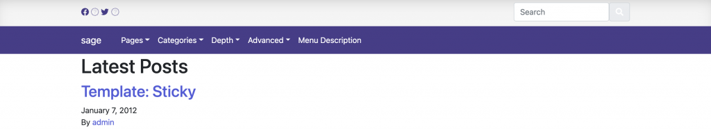
If we activate the plugin and add the new widget to the sidebar we will now have this :
It features the last post with a featured image then displays the next 4 posts underneath as a list (or 5 if you have 5 new posts without featured images). In our next post, we will be using a CSS grid to put widgets in the footer!
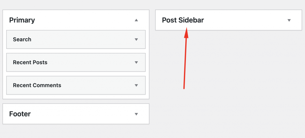
In this tutorial, we will be adding a new sidebar called “sidebar-post”, and assign both the primary and new sidebar to various pages.
Register a new sidebar
We will register the new sidebar in the setup file – this is located in app/setup.php around line 80. I will add the new “Post Sidebar” to the end of this code, so it now looks like this:
Our new sidebar is now registered in our widget area, go to Appearance/widgets in your admin panel to make sure it all works correctly, you should see 3 sidebars :
By default Sage does nothing with these, it sets them up and steps away. It leaves us free to develop the theme without any defaults. Our next task is to implement these sidebars so they output to various page templates. We have lots of ways we can achieve this, We need the content to be full width when no sidebar is displayed, yet split into columns when it is displayed. In previous versions of Bootstrap, this was a pain, but in Bootstrap 5 we are able to only set one column width, and the other column will fill in space. This allows for a nice elegant solution without the need for any PHP class shinanigans.
in views/layout/app.blade.php file is changed to this:
We add the column width to this sidebar, and we let bootstrap stack the sidebar based on screen size. You can have the sidebar displaying on small screens (≥576px) using col-sm-4, I decided to display if ≥768px using col-md-4
I also want to apply some initial styling, I will put these rules into the generic stylesheet rather than creating and importing a new one, these rules have been added to: resources/assets/styles/common/_global.scss
and lastly we need to apply a new class in the app/setup.js file, in the register sidebars section (around line 80) I have added a span in the before and after title array.
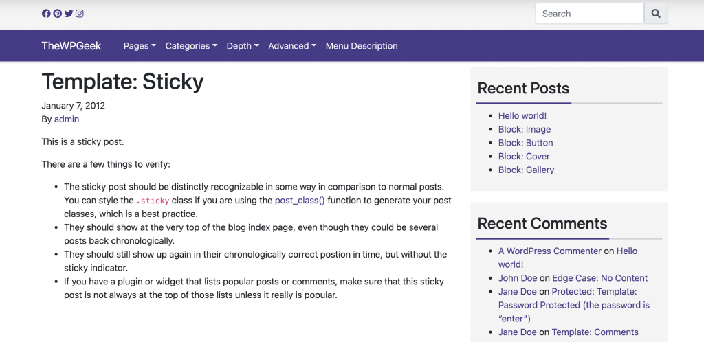
Your main page should be full screen without a sidebar, and the post pages should like this
If you are following along, now is a good time to make sure everything is working as you resize your browser. Check that the sidebars collapse as the screenspace is reduced, that the hamburger menu appears and we have no display issues across browser sizes.
Create Different Sidebars
We added a new sidebar called “Post Sidebar” earlier, let’s use that on the single page. Eventually, we can have different widgets for this more relevant to the post such as “by the same author” for now, let’s put some logic in resources/views/partials/sidebar.blade.php
From your admin panel add a few widgets to the Post Sidebar. You should see the new sidebar is used in the post pages.
Next, we will take a brief interlude to make a quick plugin for a new widget to style the new posts a little better. This plugin will be used for various site code as we progress through the theme building process.
Our header has come a long way from that early unordered list, but we should finish off our styling and ongoing issues before we continue.
Hamburger Menu in Sage not displaying
So this was an issue I had – and it seems others have also, but it’s worth checking to see if this even an issue for you before you apply my fix. If you resize your window do you see the Hamburger Menu? if not, then it seems to stem from a fix applied for a bug which to my knowledge doesn’t need fixing in the latest version of Bootstrap. Load up resources/styles/_variables.scss and comment out the last 2 lines :
The color I chose for the navbar is between dark and light. The default Bootstrap styling assumes a darker background and creates links that don’t have the required contrast. You may not have this issue if your navbar is a different color to mine. To fix this we have to use an !important tag. In our _navbar.scss file :
the default opacity is 0.5, I increased mine to 0.9 which will pass accessibility tests, but you could use plain white instead and save a few characters in the css file like this :
.navbar-nav .nav-link {
  color: #fff !important;
}
Change dropdown background
I changed my mind and went for a lighter color for the dropdown, in _navbar.scss I changed to this :
.dropdown-menu {
  background-color: #2c2455;
}
Fix sticky header with admin bar
The space the admin bar takes up causes a display issue with the sticky header. This CSS code will fix it on mobile and desktop version of the site.
body.admin-bar .sticky-top {
  top: 32px;
}

@media all and (max-width: 782px) {
  body.admin-bar .sticky-top {
    top: 0;
  }
}
Change search icon color
I removed the class (text-white) that changed the icon to white, from header.blade.php to fix contrast issue.
I like to build out sections and play with the colors, once I am happy with them I will rename them and create variables for them. Now I have decided on 2 theme colors in the menu, I will call these primary and primary-dark. It’s now time to set these up so we have access to them throughout the tutorial. The best thing with developing this way is we will be able to quickly alter the theme colors from one file in the future.
in resources/styles/common/_variables.scss Sage already has this ready to go – so lets just make a few changes, this is my file now :
As part of the header design I wanted to add another area above the navbar to contain social icons and the search bar. As we scroll down this are will disappear and the nav element will become sticky to the top of the page. This is what we will achieve in todays post, or if you are not following along with the series as we create a new theme from scratch using Sage, you can just read this post to learn about creating template partials.
We could just put all our code for this in the header.blade.php file, but it’s better to organize and split up the code into smaller chunks so we will be creating a header-top.blade.php file to contain the new code. This is called a template partial. We will be calling this in the header.blade.php file. Lets first create the new php file :
resources/views/partials/header-top.blade.php
For now just write some placeholder text in the file and save.
Load up resources/views/partials/header.blade.php and at the top of the file add this :
@include('partials.header-top')
You should now see the placeholder text appear above your menu bar. Lets also add the class “sticky-top” to the nav tag class list, so it should now look like :
As we scroll down the Navbar will stick to the top of the page.
Let’s style our new templated section. Our _navbar.scss file that we created in a previous step should be located in resources/styles, replace the contents with this :
Remove the search form we added in header.blade.php as we will be putting it in our new top area. In our header-top.blade.php file replace the contents with the following code :
This is not a styling tutorial so I won’t be going into detail on this, I generated the social media icons from my generator page and a box-shadow to the top menu using my box-shadow generator. It uses bootstraps d-flex class, to create a flexbox, and the “align-self-center” class to space vertically. We also use <div class=”wrap container”> to space the content correctly. Our header should now be styled like this :
We have a few small things left to fix, which we will tackle in the next section where we will finish off our header area. In a previous section we imported the Facebook and Twitter icons, we are missing fa-instagram and fa-pinterest. I did this for 2 reasons, the first to illustrate that we haven’t loaded the entire FontAwesome Library – just the icons we needed, and lastly to give you an opportunity to fix this yourself to help retain the information better. So, see if you can fix the missing icons, and I will see you in the next section!
We are going to use a few icons from FontAwesome. With a little bit of extra work we can import only the icons we need, instead of the entire library (10x faster according to FortAwesome), We are aiming to make a theme with 95%-100% rating for page speed, so this extra work is essential to this aim.
I plan on using some social media icons and a search bar in the nav menu we have just created, so before we move onto that let’s spend some time learning how to correctly import these icons. From our terminal window, run this command :
yarn add @fortawesome/fontawesome-svg-core
We will need to now add the individual font libraries that we will be picking font from, for me they will be the most common 2 :
Next, we need to choose the individual icons that we will be loading, to do this, we will be exploring the resources/assets/scripts/main.js file, add the following :
import { library, dom } from '@fortawesome/fontawesome-svg-core';
import { faFacebook, faTwitter } from "@fortawesome/free-brands-svg-icons";
import { faSearch } from '@fortawesome/free-solid-svg-icons';
library.add(faFacebook, faTwitter, faSearch);

dom.watch();
To import new icons to use, we will need to come back to this file and add it to the icon name object and library.add
If you are following along with this series, lets make sure everything is working and replace the header.blade.php file with the following :
We should now see the search icon image next to a search box. We will be modifying this search box shortly, and changing the header significantly in the next tutorial.
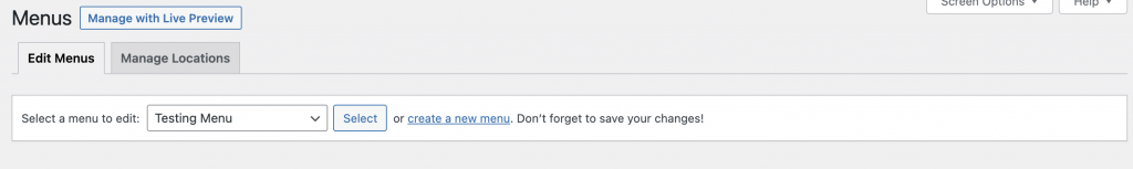
You should have added all the test data to the theme in the last step, to begin working on our menu go to “Appearance > Menu” and choose the testing menu from the drop-down :
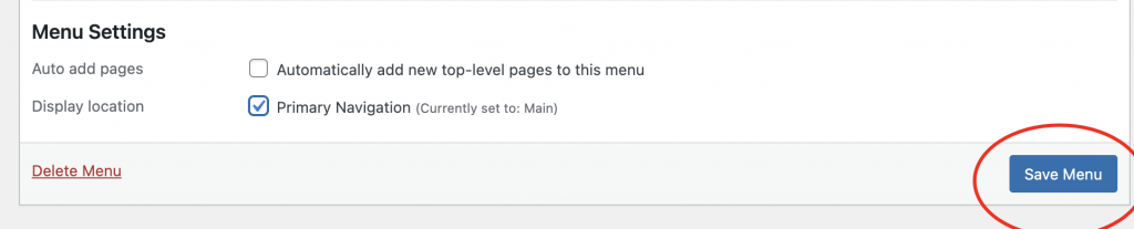
Then, set this as your primary navigation :
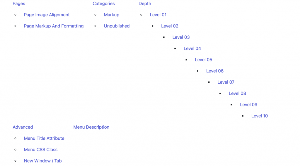
Now, visit your main page to see the visually stunning result, which will likely look a lot like mine :
Default Sage Menu Layout – Ready for styling
So we have a structure, and we could manually work on the CSS for this menu. We would need to make sure it supports multiple levels, collapsed on small screens into a hamburger menu, and supported a wide variety of screen sizes and devices. It also needs to tab correctly and support screen readers. This is a lot of work. Let’s instead, use the bootstrap library. To do this, we need to format the menu with the classes bootstrap is looking for. We need a navwalker to do this task for us.
I tried a few versions designed for sage – however, I had issues with all of them with the latest bootstrap and Sage theme. This is my solution, based entirely on this navwalker (released under GPL)
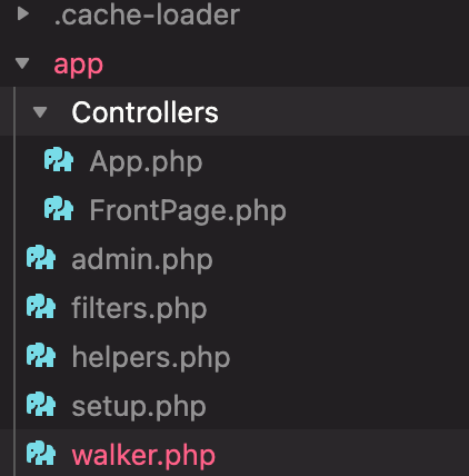
Copy all of the code in this file (visit the external site link to get the very latest version in case any changes have been made, or use the code below). We first need to create a new file to paste this into, this will live here: app/walker.php
Add this code and save :
<?php
/**
 * WP Bootstrap Navwalker
 *
 * @package WP-Bootstrap-Navwalker
 *
 * @wordpress-plugin
 * Plugin Name: WP Bootstrap Navwalker
 * Plugin URI:  https://github.com/wp-bootstrap/wp-bootstrap-navwalker
 * Description: A custom WordPress nav walker class to implement the Bootstrap 4 navigation style in a custom theme using the WordPress built in menu manager.
 * Author: Edward McIntyre - @twittem, WP Bootstrap, William Patton - @pattonwebz
 * Version: 4.3.0
 * Author URI: https://github.com/wp-bootstrap
 * GitHub Plugin URI: https://github.com/wp-bootstrap/wp-bootstrap-navwalker
 * GitHub Branch: master
 * License: GPL-3.0+
 * License URI: http://www.gnu.org/licenses/gpl-3.0.txt
 */

// Check if Class Exists.
if ( ! class_exists( 'WP_Bootstrap_Navwalker' ) ) :
	/**
	 * WP_Bootstrap_Navwalker class.
	 */
	class WP_Bootstrap_Navwalker extends Walker_Nav_Menu {

		/**
		 * Whether the items_wrap contains schema microdata or not.
		 *
		 * @since 4.2.0
		 * @var boolean
		 */
		private $has_schema = false;

		/**
		 * Ensure the items_wrap argument contains microdata.
		 *
		 * @since 4.2.0
		 */
		public function __construct() {
			if ( ! has_filter( 'wp_nav_menu_args', array( $this, 'add_schema_to_navbar_ul' ) ) ) {
				add_filter( 'wp_nav_menu_args', array( $this, 'add_schema_to_navbar_ul' ) );
			}
		}

		/**
		 * Starts the list before the elements are added.
		 *
		 * @since WP 3.0.0
		 *
		 * @see Walker_Nav_Menu::start_lvl()
		 *
		 * @param string           $output Used to append additional content (passed by reference).
		 * @param int              $depth  Depth of menu item. Used for padding.
		 * @param WP_Nav_Menu_Args $args   An object of wp_nav_menu() arguments.
		 */
		public function start_lvl( &$output, $depth = 0, $args = null ) {
			if ( isset( $args->item_spacing ) && 'discard' === $args->item_spacing ) {
				$t = '';
				$n = '';
			} else {
				$t = "\t";
				$n = "\n";
			}
			$indent = str_repeat( $t, $depth );
			// Default class to add to the file.
			$classes = array( 'dropdown-menu' );
			/**
			 * Filters the CSS class(es) applied to a menu list element.
			 *
			 * @since WP 4.8.0
			 *
			 * @param array    $classes The CSS classes that are applied to the menu `<ul>` element.
			 * @param stdClass $args    An object of `wp_nav_menu()` arguments.
			 * @param int      $depth   Depth of menu item. Used for padding.
			 */
			$class_names = join( ' ', apply_filters( 'nav_menu_submenu_css_class', $classes, $args, $depth ) );
			$class_names = $class_names ? ' class="' . esc_attr( $class_names ) . '"' : '';

			/*
			 * The `.dropdown-menu` container needs to have a labelledby
			 * attribute which points to it's trigger link.
			 *
			 * Form a string for the labelledby attribute from the the latest
			 * link with an id that was added to the $output.
			 */
			$labelledby = '';
			// Find all links with an id in the output.
			preg_match_all( '/(<a.*?id=\"|\')(.*?)\"|\'.*?>/im', $output, $matches );
			// With pointer at end of array check if we got an ID match.
			if ( end( $matches[2] ) ) {
				// Build a string to use as aria-labelledby.
				$labelledby = 'aria-labelledby="' . esc_attr( end( $matches[2] ) ) . '"';
			}
			$output .= "{$n}{$indent}<ul$class_names $labelledby>{$n}";
		}

		/**
		 * Starts the element output.
		 *
		 * @since WP 3.0.0
		 * @since WP 4.4.0 The {@see 'nav_menu_item_args'} filter was added.
		 *
		 * @see Walker_Nav_Menu::start_el()
		 *
		 * @param string           $output Used to append additional content (passed by reference).
		 * @param WP_Nav_Menu_Item $item   Menu item data object.
		 * @param int              $depth  Depth of menu item. Used for padding.
		 * @param WP_Nav_Menu_Args $args   An object of wp_nav_menu() arguments.
		 * @param int              $id     Current item ID.
		 */
		public function start_el( &$output, $item, $depth = 0, $args = null, $id = 0 ) {
			if ( isset( $args->item_spacing ) && 'discard' === $args->item_spacing ) {
				$t = '';
				$n = '';
			} else {
				$t = "\t";
				$n = "\n";
			}
			$indent = ( $depth ) ? str_repeat( $t, $depth ) : '';

			if ( false !== strpos( $args->items_wrap, 'itemscope' ) && false === $this->has_schema ) {
				$this->has_schema  = true;
				$args->link_before = '<span itemprop="name">' . $args->link_before;
				$args->link_after .= '</span>';
			}

			$classes = empty( $item->classes ) ? array() : (array) $item->classes;

			// Updating the CSS classes of a menu item in the WordPress Customizer preview results in all classes defined
			// in that particular input box to come in as one big class string.
			$split_on_spaces = function ( $class ) {
				return preg_split( '/\s+/', $class );
			};
			$classes         = $this->flatten( array_map( $split_on_spaces, $classes ) );

			/*
			 * Initialize some holder variables to store specially handled item
			 * wrappers and icons.
			 */
			$linkmod_classes = array();
			$icon_classes    = array();

			/*
			 * Get an updated $classes array without linkmod or icon classes.
			 *
			 * NOTE: linkmod and icon class arrays are passed by reference and
			 * are maybe modified before being used later in this function.
			 */
			$classes = self::separate_linkmods_and_icons_from_classes( $classes, $linkmod_classes, $icon_classes, $depth );

			// Join any icon classes plucked from $classes into a string.
			$icon_class_string = join( ' ', $icon_classes );

			/**
			 * Filters the arguments for a single nav menu item.
			 *
			 * @since WP 4.4.0
			 *
			 * @param WP_Nav_Menu_Args $args  An object of wp_nav_menu() arguments.
			 * @param WP_Nav_Menu_Item $item  Menu item data object.
			 * @param int              $depth Depth of menu item. Used for padding.
			 *
			 * @var WP_Nav_Menu_Args
			 */
			$args = apply_filters( 'nav_menu_item_args', $args, $item, $depth );

			// Add .dropdown or .active classes where they are needed.
			if ( $this->has_children ) {
				$classes[] = 'dropdown';
			}
			if ( in_array( 'current-menu-item', $classes, true ) || in_array( 'current-menu-parent', $classes, true ) ) {
				$classes[] = 'active';
			}

			// Add some additional default classes to the item.
			$classes[] = 'menu-item-' . $item->ID;
			$classes[] = 'nav-item';

			// Allow filtering the classes.
			$classes = apply_filters( 'nav_menu_css_class', array_filter( $classes ), $item, $args, $depth );

			// Form a string of classes in format: class="class_names".
			$class_names = join( ' ', $classes );
			$class_names = $class_names ? ' class="' . esc_attr( $class_names ) . '"' : '';

			/**
			 * Filters the ID applied to a menu item's list item element.
			 *
			 * @since WP 3.0.1
			 * @since WP 4.1.0 The `$depth` parameter was added.
			 *
			 * @param string           $menu_id The ID that is applied to the menu item's `<li>` element.
			 * @param WP_Nav_Menu_Item $item    The current menu item.
			 * @param WP_Nav_Menu_Args $args    An object of wp_nav_menu() arguments.
			 * @param int              $depth   Depth of menu item. Used for padding.
			 */
			$id = apply_filters( 'nav_menu_item_id', 'menu-item-' . $item->ID, $item, $args, $depth );
			$id = $id ? ' id="' . esc_attr( $id ) . '"' : '';

			$output .= $indent . '<li ' . $id . $class_names . '>';

			// Initialize array for holding the $atts for the link item.
			$atts           = array();
			$atts['title']  = ! empty( $item->attr_title ) ? $item->attr_title : '';
			$atts['target'] = ! empty( $item->target ) ? $item->target : '';
			if ( '_blank' === $item->target && empty( $item->xfn ) ) {
				$atts['rel'] = 'noopener noreferrer';
			} else {
				$atts['rel'] = ! empty( $item->xfn ) ? $item->xfn : '';
			}

			// If the item has_children add atts to <a>.
			if ( $this->has_children && 0 === $depth ) {
				$atts['href']          = '#';
				$atts['data-toggle']   = 'dropdown';
				$atts['aria-haspopup'] = 'true';
				$atts['aria-expanded'] = 'false';
				$atts['class']         = 'dropdown-toggle nav-link';
				$atts['id']            = 'menu-item-dropdown-' . $item->ID;
			} else {
				if ( true === $this->has_schema ) {
					$atts['itemprop'] = 'url';
				}

				$atts['href'] = ! empty( $item->url ) ? $item->url : '#';
				// For items in dropdowns use .dropdown-item instead of .nav-link.
				if ( $depth > 0 ) {
					$atts['class'] = 'dropdown-item';
				} else {
					$atts['class'] = 'nav-link';
				}
			}

			$atts['aria-current'] = $item->current ? 'page' : '';

			// Update atts of this item based on any custom linkmod classes.
			$atts = self::update_atts_for_linkmod_type( $atts, $linkmod_classes );

			// Allow filtering of the $atts array before using it.
			$atts = apply_filters( 'nav_menu_link_attributes', $atts, $item, $args, $depth );

			// Build a string of html containing all the atts for the item.
			$attributes = '';
			foreach ( $atts as $attr => $value ) {
				if ( ! empty( $value ) ) {
					$value       = ( 'href' === $attr ) ? esc_url( $value ) : esc_attr( $value );
					$attributes .= ' ' . $attr . '="' . $value . '"';
				}
			}

			// Set a typeflag to easily test if this is a linkmod or not.
			$linkmod_type = self::get_linkmod_type( $linkmod_classes );

			// START appending the internal item contents to the output.
			$item_output = isset( $args->before ) ? $args->before : '';

			/*
			 * This is the start of the internal nav item. Depending on what
			 * kind of linkmod we have we may need different wrapper elements.
			 */
			if ( '' !== $linkmod_type ) {
				// Is linkmod, output the required element opener.
				$item_output .= self::linkmod_element_open( $linkmod_type, $attributes );
			} else {
				// With no link mod type set this must be a standard <a> tag.
				$item_output .= '<a' . $attributes . '>';
			}

			/*
			 * Initiate empty icon var, then if we have a string containing any
			 * icon classes form the icon markup with an <i> element. This is
			 * output inside of the item before the $title (the link text).
			 */
			$icon_html = '';
			if ( ! empty( $icon_class_string ) ) {
				// Append an <i> with the icon classes to what is output before links.
				$icon_html = '<i class="' . esc_attr( $icon_class_string ) . '" aria-hidden="true"></i> ';
			}

			/** This filter is documented in wp-includes/post-template.php */
			$title = apply_filters( 'the_title', $item->title, $item->ID );

			/**
			 * Filters a menu item's title.
			 *
			 * @since WP 4.4.0
			 *
			 * @param string           $title The menu item's title.
			 * @param WP_Nav_Menu_Item $item  The current menu item.
			 * @param WP_Nav_Menu_Args $args  An object of wp_nav_menu() arguments.
			 * @param int              $depth Depth of menu item. Used for padding.
			 */
			$title = apply_filters( 'nav_menu_item_title', $title, $item, $args, $depth );

			// If the .sr-only class was set apply to the nav items text only.
			if ( in_array( 'sr-only', $linkmod_classes, true ) ) {
				$title         = self::wrap_for_screen_reader( $title );
				$keys_to_unset = array_keys( $linkmod_classes, 'sr-only', true );
				foreach ( $keys_to_unset as $k ) {
					unset( $linkmod_classes[ $k ] );
				}
			}

			// Put the item contents into $output.
			$item_output .= isset( $args->link_before ) ? $args->link_before . $icon_html . $title . $args->link_after : '';

			/*
			 * This is the end of the internal nav item. We need to close the
			 * correct element depending on the type of link or link mod.
			 */
			if ( '' !== $linkmod_type ) {
				// Is linkmod, output the required closing element.
				$item_output .= self::linkmod_element_close( $linkmod_type );
			} else {
				// With no link mod type set this must be a standard <a> tag.
				$item_output .= '</a>';
			}

			$item_output .= isset( $args->after ) ? $args->after : '';

			// END appending the internal item contents to the output.
			$output .= apply_filters( 'walker_nav_menu_start_el', $item_output, $item, $depth, $args );
		}

		/**
		 * Menu fallback.
		 *
		 * If this function is assigned to the wp_nav_menu's fallback_cb variable
		 * and a menu has not been assigned to the theme location in the WordPress
		 * menu manager the function will display nothing to a non-logged in user,
		 * and will add a link to the WordPress menu manager if logged in as an admin.
		 *
		 * @param array $args passed from the wp_nav_menu function.
		 * @return string|void String when echo is false.
		 */
		public static function fallback( $args ) {
			if ( ! current_user_can( 'edit_theme_options' ) ) {
				return;
			}

			// Initialize var to store fallback html.
			$fallback_output = '';

			// Menu container opening tag.
			$show_container = false;
			if ( $args['container'] ) {
				/**
				 * Filters the list of HTML tags that are valid for use as menu containers.
				 *
				 * @since WP 3.0.0
				 *
				 * @param array $tags The acceptable HTML tags for use as menu containers.
				 *                    Default is array containing 'div' and 'nav'.
				 */
				$allowed_tags = apply_filters( 'wp_nav_menu_container_allowedtags', array( 'div', 'nav' ) );
				if ( is_string( $args['container'] ) && in_array( $args['container'], $allowed_tags, true ) ) {
					$show_container   = true;
					$class            = $args['container_class'] ? ' class="menu-fallback-container ' . esc_attr( $args['container_class'] ) . '"' : ' class="menu-fallback-container"';
					$id               = $args['container_id'] ? ' id="' . esc_attr( $args['container_id'] ) . '"' : '';
					$fallback_output .= '<' . $args['container'] . $id . $class . '>';
				}
			}

			// The fallback menu.
			$class            = $args['menu_class'] ? ' class="menu-fallback-menu ' . esc_attr( $args['menu_class'] ) . '"' : ' class="menu-fallback-menu"';
			$id               = $args['menu_id'] ? ' id="' . esc_attr( $args['menu_id'] ) . '"' : '';
			$fallback_output .= '<ul' . $id . $class . '>';
			$fallback_output .= '<li class="nav-item"><a href="' . esc_url( admin_url( 'nav-menus.php' ) ) . '" class="nav-link" title="' . esc_attr__( 'Add a menu', 'wp-bootstrap-navwalker' ) . '">' . esc_html__( 'Add a menu', 'wp-bootstrap-navwalker' ) . '</a></li>';
			$fallback_output .= '</ul>';

			// Menu container closing tag.
			if ( $show_container ) {
				$fallback_output .= '</' . $args['container'] . '>';
			}

			// if $args has 'echo' key and it's true echo, otherwise return.
			if ( array_key_exists( 'echo', $args ) && $args['echo'] ) {
				// phpcs:ignore WordPress.Security.EscapeOutput.OutputNotEscaped
				echo $fallback_output;
			} else {
				return $fallback_output;
			}
		}

		/**
		 * Filter to ensure the items_Wrap argument contains microdata.
		 *
		 * @since 4.2.0
		 *
		 * @param  array $args The nav instance arguments.
		 * @return array $args The altered nav instance arguments.
		 */
		public function add_schema_to_navbar_ul( $args ) {
			$wrap = $args['items_wrap'];
			if ( strpos( $wrap, 'SiteNavigationElement' ) === false ) {
				$args['items_wrap'] = preg_replace( '/(>).*>?\%3\$s/', ' itemscope itemtype="http://www.schema.org/SiteNavigationElement"$0', $wrap );
			}

			return $args;
		}

		/**
		 * Find any custom linkmod or icon classes and store in their holder
		 * arrays then remove them from the main classes array.
		 *
		 * Supported linkmods: .disabled, .dropdown-header, .dropdown-divider, .sr-only
		 * Supported iconsets: Font Awesome 4/5, Glypicons
		 *
		 * NOTE: This accepts the linkmod and icon arrays by reference.
		 *
		 * @since 4.0.0
		 *
		 * @param array   $classes         an array of classes currently assigned to the item.
		 * @param array   $linkmod_classes an array to hold linkmod classes.
		 * @param array   $icon_classes    an array to hold icon classes.
		 * @param integer $depth           an integer holding current depth level.
		 *
		 * @return array  $classes         a maybe modified array of classnames.
		 */
		private function separate_linkmods_and_icons_from_classes( $classes, &$linkmod_classes, &$icon_classes, $depth ) {
			// Loop through $classes array to find linkmod or icon classes.
			foreach ( $classes as $key => $class ) {
				/*
				 * If any special classes are found, store the class in it's
				 * holder array and and unset the item from $classes.
				 */
				if ( preg_match( '/^disabled|^sr-only/i', $class ) ) {
					// Test for .disabled or .sr-only classes.
					$linkmod_classes[] = $class;
					unset( $classes[ $key ] );
				} elseif ( preg_match( '/^dropdown-header|^dropdown-divider|^dropdown-item-text/i', $class ) && $depth > 0 ) {
					/*
					 * Test for .dropdown-header or .dropdown-divider and a
					 * depth greater than 0 - IE inside a dropdown.
					 */
					$linkmod_classes[] = $class;
					unset( $classes[ $key ] );
				} elseif ( preg_match( '/^fa-(\S*)?|^fa(s|r|l|b)?(\s?)?$/i', $class ) ) {
					// Font Awesome.
					$icon_classes[] = $class;
					unset( $classes[ $key ] );
				} elseif ( preg_match( '/^glyphicon-(\S*)?|^glyphicon(\s?)$/i', $class ) ) {
					// Glyphicons.
					$icon_classes[] = $class;
					unset( $classes[ $key ] );
				}
			}

			return $classes;
		}

		/**
		 * Return a string containing a linkmod type and update $atts array
		 * accordingly depending on the decided.
		 *
		 * @since 4.0.0
		 *
		 * @param array $linkmod_classes array of any link modifier classes.
		 *
		 * @return string                empty for default, a linkmod type string otherwise.
		 */
		private function get_linkmod_type( $linkmod_classes = array() ) {
			$linkmod_type = '';
			// Loop through array of linkmod classes to handle their $atts.
			if ( ! empty( $linkmod_classes ) ) {
				foreach ( $linkmod_classes as $link_class ) {
					if ( ! empty( $link_class ) ) {

						// Check for special class types and set a flag for them.
						if ( 'dropdown-header' === $link_class ) {
							$linkmod_type = 'dropdown-header';
						} elseif ( 'dropdown-divider' === $link_class ) {
							$linkmod_type = 'dropdown-divider';
						} elseif ( 'dropdown-item-text' === $link_class ) {
							$linkmod_type = 'dropdown-item-text';
						}
					}
				}
			}
			return $linkmod_type;
		}

		/**
		 * Update the attributes of a nav item depending on the limkmod classes.
		 *
		 * @since 4.0.0
		 *
		 * @param array $atts            array of atts for the current link in nav item.
		 * @param array $linkmod_classes an array of classes that modify link or nav item behaviors or displays.
		 *
		 * @return array                 maybe updated array of attributes for item.
		 */
		private function update_atts_for_linkmod_type( $atts = array(), $linkmod_classes = array() ) {
			if ( ! empty( $linkmod_classes ) ) {
				foreach ( $linkmod_classes as $link_class ) {
					if ( ! empty( $link_class ) ) {
						/*
						 * Update $atts with a space and the extra classname
						 * so long as it's not a sr-only class.
						 */
						if ( 'sr-only' !== $link_class ) {
							$atts['class'] .= ' ' . esc_attr( $link_class );
						}
						// Check for special class types we need additional handling for.
						if ( 'disabled' === $link_class ) {
							// Convert link to '#' and unset open targets.
							$atts['href'] = '#';
							unset( $atts['target'] );
						} elseif ( 'dropdown-header' === $link_class || 'dropdown-divider' === $link_class || 'dropdown-item-text' === $link_class ) {
							// Store a type flag and unset href and target.
							unset( $atts['href'] );
							unset( $atts['target'] );
						}
					}
				}
			}
			return $atts;
		}

		/**
		 * Wraps the passed text in a screen reader only class.
		 *
		 * @since 4.0.0
		 *
		 * @param string $text the string of text to be wrapped in a screen reader class.
		 * @return string      the string wrapped in a span with the class.
		 */
		private function wrap_for_screen_reader( $text = '' ) {
			if ( $text ) {
				$text = '<span class="sr-only">' . $text . '</span>';
			}
			return $text;
		}

		/**
		 * Returns the correct opening element and attributes for a linkmod.
		 *
		 * @since 4.0.0
		 *
		 * @param string $linkmod_type a sting containing a linkmod type flag.
		 * @param string $attributes   a string of attributes to add to the element.
		 *
		 * @return string              a string with the openign tag for the element with attribibutes added.
		 */
		private function linkmod_element_open( $linkmod_type, $attributes = '' ) {
			$output = '';
			if ( 'dropdown-item-text' === $linkmod_type ) {
				$output .= '<span class="dropdown-item-text"' . $attributes . '>';
			} elseif ( 'dropdown-header' === $linkmod_type ) {
				/*
				 * For a header use a span with the .h6 class instead of a real
				 * header tag so that it doesn't confuse screen readers.
				 */
				$output .= '<span class="dropdown-header h6"' . $attributes . '>';
			} elseif ( 'dropdown-divider' === $linkmod_type ) {
				// This is a divider.
				$output .= '<div class="dropdown-divider"' . $attributes . '>';
			}
			return $output;
		}

		/**
		 * Return the correct closing tag for the linkmod element.
		 *
		 * @since 4.0.0
		 *
		 * @param string $linkmod_type a string containing a special linkmod type.
		 *
		 * @return string              a string with the closing tag for this linkmod type.
		 */
		private function linkmod_element_close( $linkmod_type ) {
			$output = '';
			if ( 'dropdown-header' === $linkmod_type || 'dropdown-item-text' === $linkmod_type ) {
				/*
				 * For a header use a span with the .h6 class instead of a real
				 * header tag so that it doesn't confuse screen readers.
				 */
				$output .= '</span>';
			} elseif ( 'dropdown-divider' === $linkmod_type ) {
				// This is a divider.
				$output .= '</div>';
			}
			return $output;
		}

		/**
		 * Flattens a multidimensional array to a simple array.
		 *
		 * @param array $array a multidimensional array.
		 *
		 * @return array a simple array
		 */
		public function flatten( $array ) {
			$result = array();
			foreach ( $array as $element ) {
				if ( is_array( $element ) ) {
					array_push( $result, ...$this->flatten( $element ) );
				} else {
					$result[] = $element;
				}
			}
			return $result;
		}

	}

endif;
in resources/functions.php we need to add “walker” to the array around line 60
/*
 * Sage required files
 *
 * The mapped array determines the code library included in your theme.
 * Add or remove files to the array as needed. Supports child theme overrides.
 */
array_map(function ($file) use ($sage_error) {
    $file = "../app/{$file}.php";
    if (!locate_template($file, true, true)) {
        $sage_error(sprintf(__('Error locating <code>%s</code> for inclusion.', 'sage'), $file), 'File not found');
    }
}, ['helpers', 'setup', 'filters', 'admin', 'walker']);
in resources/views/partials/header.blade.php remove everything and use this code:
We will be making some style changes to the menu, so let’s make a new stylesheet to contain all of this. In resources/assets/styles/main.scss at the very bottom of the file, add this extra import :
@import "components/navbar";
create a new file in : resources/assets/styles/components/ and name this new file : _navbar.scss for now just add this code:
Save everything and we should now have a menu that looks like this :
It functions great on all screens, has a hamburger menu, tabs correctly “enter” opens dropdowns, and is accessible friendly. We also have a .scss style sheet to make display changes in and make it look a little nicer in our next installment!
We should do a tiny bit more setup just to make things smoother as we progress. First I want you to install wp-cli – this is the “WordPress – Comand Line Interface”. I won’t be using it much, but you will find it’s often used in documentation so I found it useful to have.
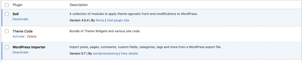
Read about the advantages and cleaner markup using soil on the official sage soil page here You will notice it costs money, however, it is released under the MIT license which means we can install it and use it free of charge. They do great work and the support given from paying for this plugin is small compared to the benefits of bedrock/sage/soil. So use the plugin now to try it out but once the site is launched circle back around and pay for the license.
composer require roots/soil
Back in your theme folder (bedrock/web/app/themes/name) reload everything
npm run start
Go to your admin panel and activate the Soil plugin.
app/setup.php
Take a look in the app/setup.php file, this one is important and you will likely use it a lot, you add theme support, menus and image sizes here. Lets just add a new image size for now, around line 50 you will find this :
    /*
     * Enable post thumbnails
     * @link https://developer.wordpress.org/themes/functionality/featured-images-post-thumbnails/
     */
    add_theme_support('post-thumbnails');
underneath, lets add our new image size
add_image_size('post-featured', 1280, 628, true);
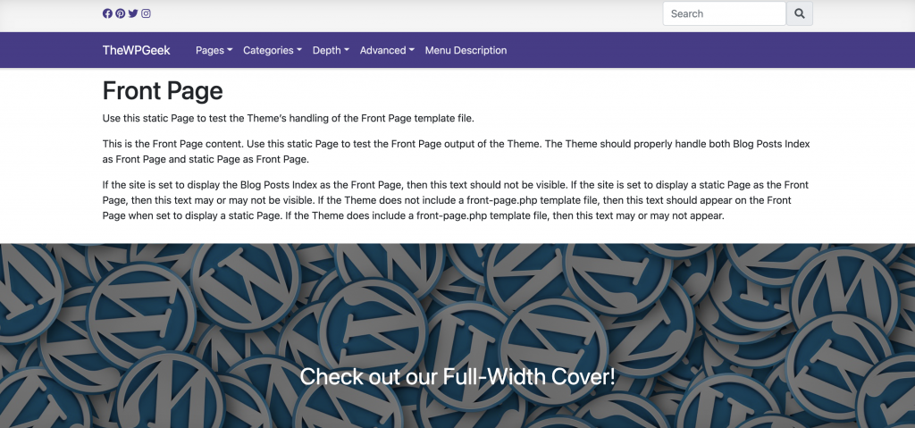
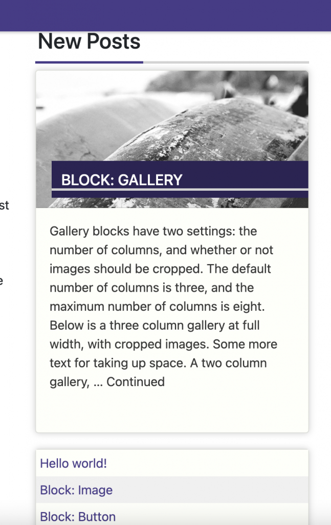
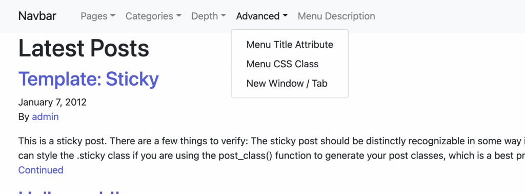
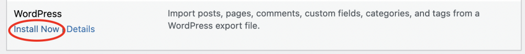
We will come back to this file as we develop our theme. Our next tutorial will show you how to tackle the menu, but before we do this let’s install the Theme Unit Test dummy content. On the linked page, you will find an XML file to download. This will add a bunch of test content, including items we can add to our menu. Once you have it downloaded, go to your admin panel and Tools > Import and install the importer :
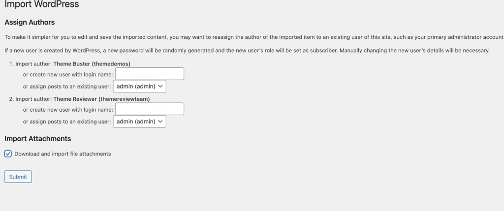
Lastly, once the install has finished, click “Run Importer” and then choose the downloaded XML file and import some dummy data using the setting below